Tableau Public now supports Google Spreadsheets. I didn’t think of this as anything special. But after I realized cloud-based spreadsheets means dashboards that can be automatically update. I set out on a way to constantly update data in Tableau. Given my limited toolset – mainly R, Tableau, and a handful of AWS tools.
The Data
I decided I wanted to monitor NFL ticket prices on an hourly basis. I’d hit the API for 253 regular season, United States-based games – 3 are in London. This is not easy since there is no pre-built datasets. I’d need to hit a secondary ticket market API and store that data somewhere.
API Data Extraction
I decided to use secondary ticket market data from the StubHub API. To stream data, I created a cloud instance of R and Rstudio on an AWS Elastic Cloud Compute instance. FYI: EC2 is a web service that provides resizable compute capacity in the cloud. It is designed to make web-scale cloud computing easier for developers. In short, it’s a cloud computer.
Data Storage
Now comes the interesting part. I’m taking data from the API and processing it on EC2. I need to store it somewhere. Since I’m using Amazon already, used its siple files storage system: Simple Storage Service – or S3 – provides developers and IT teams with secure, durable, highly-scalable cloud storage.
Data Processing
The data from StubHub is compiled every hour. Its also stored on S3. Using that data I am processing and want to send it to Google Spreadsheets. And technically I was able to do this from R, but it required constant manual authentication for the R-Google handshake every 4 hours. That was a pain, and would require me to wake-up at night so I decided to go a different route.
More Handshakes
Good news. I could save data from EC2/RStudio into S3. From there I could load data from S3 into Google Spreadsheets using the Blockspring API that sends .csv files from S3 to Google. Also with the API I can update data hourly. Bonus.
Intermission
In case you are wondering here’s whats going on:

I wish this was as easy as I wrote it down to be. But a lot is going on.
The Visualization
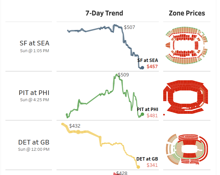
There are two different things happening in this visualization. First are the line charts. Second are the stadium shapes. These are not difficult to pull, but take some time to do. Remember data was pulled from StubHub. In this data are IDs for stadium and the corresponding zones. This means if I have the shape files I can plot data as shapes. Here is a stadium for an upcoming game.
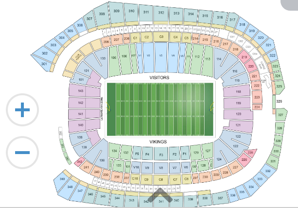
Good news. The colors on each of the sections of the stadium are the result of custom polygons in the html code. This means I can download the html from the webpage and extract the polygons from the graphic. I did this using some simple R code. This extracts the svg. That’s the good news.
stadium <-

   paste0(loc, team, '.htm') %>%

   xml2::read_html() %>%

   rvest::html_nodes('.svgcontainer svg path') %>%

   .[1:length(.) - 1]

stadium %>%

   as.character() %>%

   c('<svg>', ., '</svg>') %>%

   stringr::str_replace_all('class=\"st0\"', '') %>%

   writeLines(., file(paste0(loc, team, '.txt')))
The bad news: Another tool is needed. This just directs html on how to create the polygon, but it doesn’t have the actual points along the polygon – which is what I want. This requires a reformat of the data to a file type called .wkt. There are connectors for R to do this, but I didn’t have time to learn it, so I used an online site to make this happen. After I did this I saved the shapes – digestible by Tableau – back to the EC2/Rstudio instance. After that It’s pretty easy to read wkt files into R. This lets me get x and y values and some basic indicies.
More bad news: hand coding. The converter didn’t carry some of the underlying data over to the shapes. I couldn’t find a way around other than hand coding 9,900 rows of data. This meant looking at all sections in 32 stadiums. And some of them were very unorganized. But once this is done, I can connect ticket prices back to zones in stadiums.
Send a MMS Text
Prior to the start of this final Iron Viz feeder I joked with a few colleagues my next viz would be able to text a picture of it to you. And about 48 hours prior to submitting my visualization – while my data was still aggregating – I decided I needed to figure out how to do this. My coding skills outside of R are very limited, but there are a number of cool packages available in R that would allow me to send a text message. Here is how I did it:
Twilio is a messaging tool. I can send or receive text or phone calls with the service. Through the service I can make an API call and send the text message. The httr package makes it easy to do. Below is the code I used to send the message:
httr::POST(

paste0('https://api.twilio.com/2010-04-01/Accounts/', 'XXXX', '/Messages.json'),

config=authenticate('XXXXX', 'XXXXX', "basic"),

body = list(

   Body='See which NFL games had the hottest ticket prices in week 2: https://public.tableau.com/profile/stanke#!/vizhome/Whohasthehottestticketsrightnow/HottestNFLTicket',

   From="6122550403",

   Method="GET",

   To=paste0("+1", stringr::str_extract(as.character(isolate(input$phone_number)), "[[:digit:]]+")),

   MediaUrl = "https://XXXXXX.com/dashboard.png",

   encode = 'json'

)
Here I am sending my API a authenticated message in json format. I’m specifying the to number, from number, the text message and image URL. Everything is hard-coded with the exception of the input number – which I’ll talk about in a minute.
But first the image send from the MMS text. To do this I used the webshot package in R. This package requires phatom.js, ImageMagick, and GraphicsMagick. Once those were installed onto my EC2 instance I could just run the code below and it would grab an image of any website – Including the published tableau dashboard.
webshot::webshot(

"https://public.tableau.com/profile/stanke#!/vizhome/Whohasthehottestticketsrightnow/Print",

"dashboard.png",

selector = ".tableau-viz",

delay = 8,

vwidth = '800') %>%

webshot::resize('300%') %>%

webshot::shrink()
Then I just place this onto a webserver using the put_object function from the aws.s3 function:
aws.s3::put_object('dashboard.png')
The code you see above is essential for sending the text. But I still need a user interface to go with the code. I relied on Shiny, which is a web application framework for R. I created an open text box and a submit button which then triggered the code you see above. I wanted an alert to pop-up saying the message was sent, but I didn’t have time since this was less than 6 hours before the deadline for the visualization to be submitted and I still didn’t even know what my visualization was going to look like.
I thought the functionality turned out all right considering I was still learning how to program it just hours before the due date. I just added a bunch of text clarifying how the text worked to the user. It’s overkill and takes away from the experience a bit, but it’s still pretty cool that it works.