Below is a chart built for #WorkoutWednesday. It seems to have thrown people off a bit.
Just as a reminder here are the requirements:
- Use sales for 2017.
- The size of the dashboard 500px x 600px.
- If you think of the segments as a clock, Week 1 should be at the 12:00 position.
- The weeks should be evenly spaced based on the week number.
- You’ll be using geometry. The minimum radius is 1. The maximum radius is 2.3. (Spoilers provide some math help.)
- The space between the segments is .15.
- Note the tooltips to get some assistance on your math.
Before we tackle the circle, lets just create a line chart that emulates a bar chart.
Step 1: Provide total control over each line thru a union
It’s important to consider one foundational principle when building any visualization in Tableau: you will only show aggregate information based on the number of dimensions you have on a view – unless you use a level-of-detail calculation. The chart above shows sales by segment and week of the year. Week of year and segment are considered dimensions by Tableau and therefore if we create a view we should have one mark for every combination. And if we create that data we’ll see it’s exactly what we produce. Basically a dot plot.
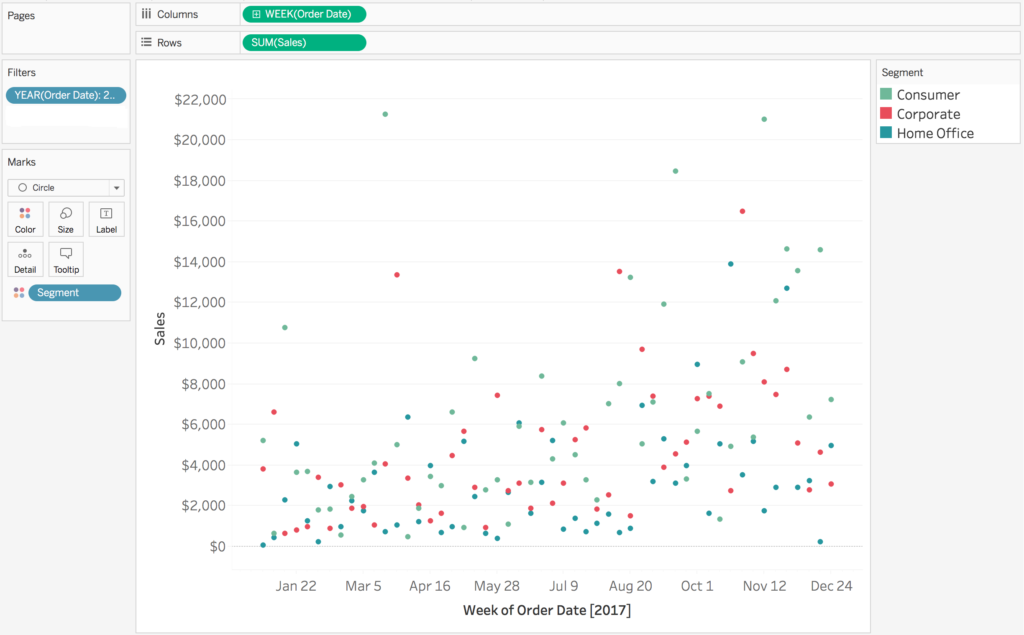
But we really want a line. and a line is made up of two points. With Tableau its impossible to have two marks per combination on a view. In order to “hack” this line I’m going to use a trick and union the data to itself (Note: there are other ways this can be done but it’s just the way I prefer because I can keep the data balanced as every data point is duplicated twice).
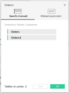
After we union the data to itself. There is a new field in the data called [Table Name] this distinguishes the data sources from each other. My [Table Name] dimension has two members “Order” and “Order$” — yours is likely “sales.csv” and “sales.csv1”.
With this data now duplicated, we can control the start point of a line by using logic statement with [Table Name]. In this case we’re going to build a base calculation that will help us along the way
[Data Level]
[Table Name] = "Order"
Again this is going to basically allow us to control each mark twice — one for each dataset.
Step 2: Build base calculations
When doing analyses like this I like to use level of detail calculations because I don’t have to really think about aggregations based on the marks on the view, they are just aggregated to the level I am working with. Since I know I’m working with week and segment data I’m going to build a few level-of-detail calculations.
[Consumer Sales / Week]
{FIXED DATETRUNC("week", [Order Date]) :
   SUM(IF [Segment] = "Consumer" THEN [Sales] END)
}
[Corporate Sales / Week]
{FIXED DATETRUNC("week", [Order Date]) :
   SUM(IF [Segment] = "Corporate" THEN [Sales] END)
}
[Home Office Sales / Week]
{FIXED DATETRUNC("week", [Order Date]) :
   SUM(IF [Segment] = "Home Office" THEN [Sales] END)
}
[Sales / Week]
{FIXED DATETRUNC("week", [Order Date]) :
   SUM([Sales])
}
* This actually produces totals twice the value expected because we unioned the data to itself, but will be fine for this analysis since we are doing a percent of total. *
Each of these calculations are going to be very useful as we built out the chart above.
Step 3: Emulate a stacked bar chart
Building this chart is a lot like building a stacked bar chart that shows percent of totals.
Consider how we will build each part of a stacked bar chart for:
Corporate
- start: 0
- end: [total % of corporate]
Consumer
- start: [total % of corporate]
end: [total % of corporate] + [total % of consumer]
Home Office
- start: [total % of corporate] + [total % of consumer]
- end: 1
We con control the start and end points of each part of these lines using the [Data Level] function we just put together. When [Data Level] is true, let’s say that’s the start of the line and when [Data Level] is false lets say that’s the end of the line. The function would then look like this
Line Location
IF [Data Level]           // Returns TF
THEN CASE [Segment]       // For true create start of each line
     WHEN "Corporate" THEN 0
     WHEN "Consumer" THEN [Corporate Sales / Week]/[Sales / Week]
     WHEN "Home Office" THEN ([Corporate Sales / Week] + [Consumer Sales / Week])/[Sales / Week]
     END
ELSE CASE [Segment]       // For false create end of each line
     WHEN "Corporate" THEN [Corporate Sales / Week]/[Sales / Week]
     WHEN "Consumer" THEN ([Corporate Sales / Week] + [Consumer Sales / Week])/[Sales / Week]
     THEN "Home Office" THEN 1
     END
END
Let’s create a line chart to see what this produces.
Add week of [Order Date] to Columns. Add [Line Location] to rows and make it a continuous dimension. Add [Segment] to color, change the mark type to line, add [Table Name] to path, and also add week of [Order Date] to detail. Voila! A line chart that looks like a bar chart!
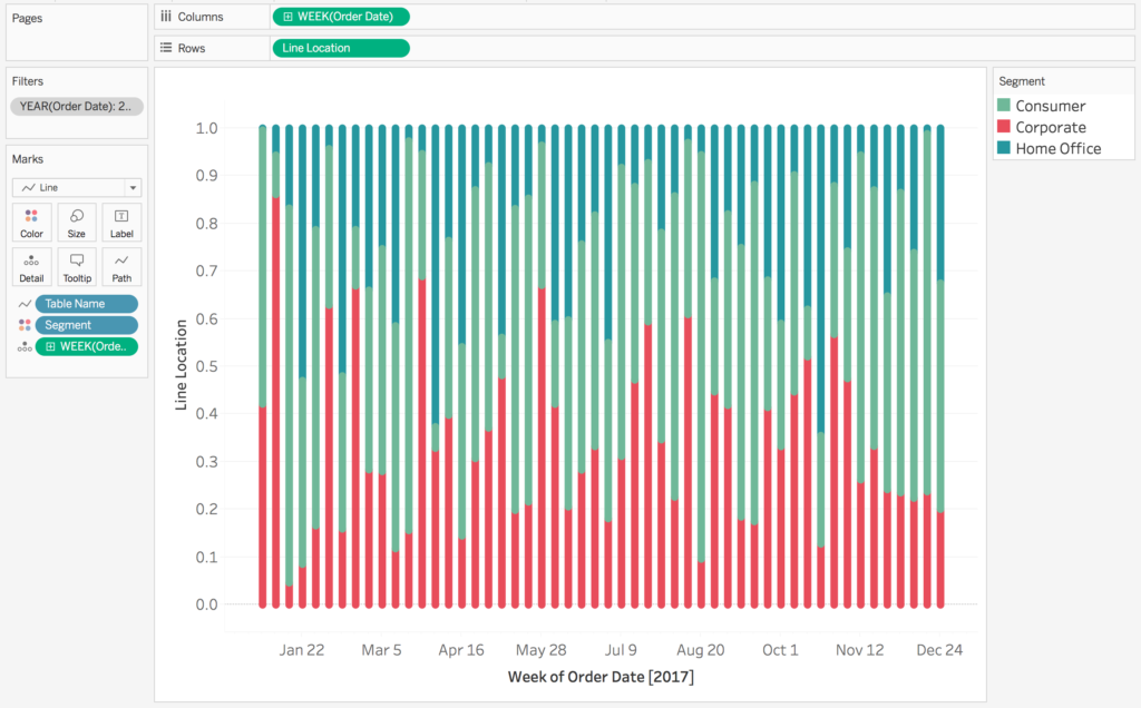
Let’s get the spacing to work out. Edit your [Line Location] calculation. We’re going to make it easy and hard code the spacing in.
Line Location
IF [Data Level]           // Returns TF
THEN CASE [Segment]       // For true create start of each line
     WHEN "Corporate" THEN 0
     WHEN "Consumer" THEN [Corporate Sales / Week]/[Sales / Week]+ .15
     WHEN "Home Office" THEN ([Corporate Sales / Week] + [Consumer Sales / Week])/[Sales / Week]+ .30
     END
ELSE CASE [Segment]       // For false create end of each line
     WHEN "Corporate" THEN [Corporate Sales / Week]/[Sales / Week]
     WHEN "Consumer" THEN ([Corporate Sales / Week] + [Consumer Sales / Week])/[Sales / Week]+ .15
     THEN "Home Office" THEN 1+ .30
     END
END
This hard-coding adds a nice space to our chart.
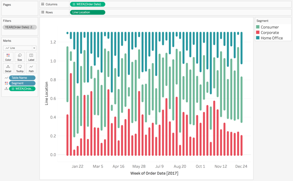
Believe it or not you are almost there for the whole thing!
Step 4: Unit Circle time!
They key to all of this is understanding geometry from your youth, particularly the formula for a circle:
[radius] * sin(2π * [% of circle]) and/or [radius] * sin(2π * [% of circle])
I’ll give you a hint, we just built our radius sans one tiny thing, so all we need is to figure out the % of the circle. And the percent of the circle is just the percent of year completed. Remember that we want basically Week 1 to be equal to zero based on the requirements. so:
Percent of Year
// This returns the percent of the year completed for each week
( DATEPART("week", [Order Date]) - 1 )
/
{FIXED YEAR([Order Date]) : MAX(DATEPART("week", [Order Date]))}
Now we can quickly build our [x] and [y] calculations:
x
[Line Location] * SIN(2*PI() * [Percent of Year])
y
[Line Location] * COS(2*PI() * [Percent of Year])
Now let’s build a view. Add [x] to columns and [y] rows. Make sure they are both continuous dimensions. Change the mark type to line. Add [Segment] to color, [Table Name] to Path, and week of [Order Date] to Detail. Add [Order Date] to filter and select just the year of 2017.
That produces this view:
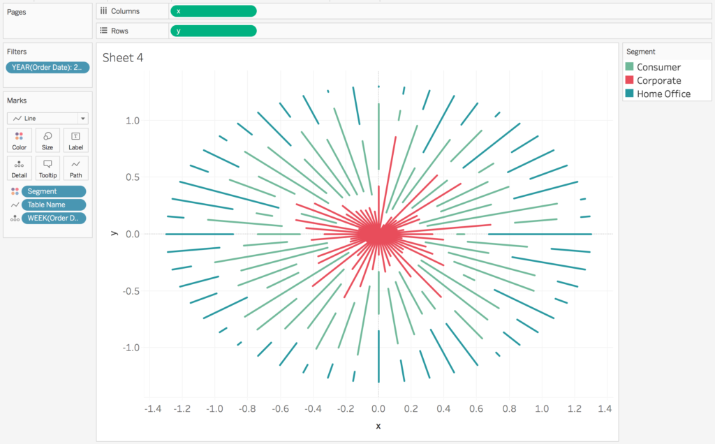
You are actually so very close. The problem is the start point or our radius — [Line Location] — we want the minimum value to be 1 and the maximum value to be 2.3. Our current minimum and maximum values are 0 and 1.3. You can tell this by going back and looking at the last line chart we created where [Order Date] was on the columns shelf.
All we need to do is edit our existing [Data Level] calculation and add +1 right at the beginning.
Line Location
1 +
IF [Data Level]           // Returns TF
THEN CASE [Segment]       // For true create start of each line
     WHEN "Corporate" THEN 0
     WHEN "Consumer" THEN [Corporate Sales / Week]/[Sales / Week] + .15
     WHEN "Home Office" THEN ([Corporate Sales / Week] + [Consumer Sales / Week])/[Sales / Week] + .30
     END
ELSE CASE [Segment]       // For false create end of each line
     WHEN "Corporate" THEN [Corporate Sales / Week]/[Sales / Week]
     WHEN "Consumer" THEN ([Corporate Sales / Week] + [Consumer Sales / Week])/[Sales / Week] + .15
     THEN "Home Office" THEN 1 + .30
     END
END
This changes our chart to:
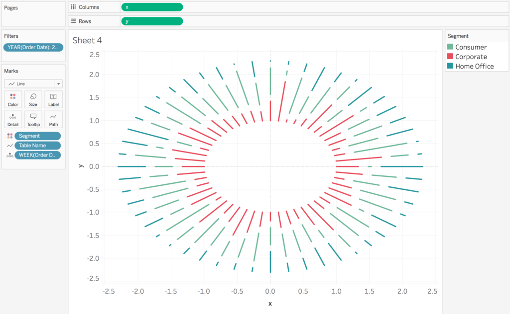
Now with a little formatting we’ll have the chart we’re looking for: